Lichtenstein At The Tate Modern
 The first time I saw a Lichtenstein, I was underwhelmed. A blown up comic book?! What's so great about that? But this Retrospective at the Tate Modern doesn't just draw attention to his skill; by putting his art in context and showing it's evolution, it explores the philosophical element of his work, combining high and low art.
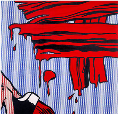
Lichtenstein's approach was driven by his desire to explore questions of authorship and originality, and to understand what causes aesthetic value in post-industrial art. Lichtenstein was interested in how "two things that are very much alike differ in value... there must be some very subtle thing that has to do with painting." He explored the interface between industrial-scale printing and painting, by hand-replicating printing techniques. The brushstroke itself became a central feature of his work - and he painted stylised abstractions of brushstrokes, in order to draw attention to what he saw as the primary contributor of value to art.
Lichtenstein was fascinated by commercial and corporate imagery, and began replicating it with various changes. He never worked from "life" - instead, he re-interpreted existing images, experimenting with styles and techniques of representation, and discovered Ben-Day dots - which printing presses used to mass-produce colour. Lichenstein pain-stakingly painted each dot individually, through screen stencils (originally he used a dog-grooming brush). In this way he explored that "subtle thing" by bringing the aesthetic value of the brushstroke to an industrial technique.
The first work in which we first see the subject matter that made Lichtenstein's name is Look Mickey; an image of Donald Duck & Mickey Mouse fishing. A re-drawing of an illustration from one of his son's books, it is an odd subject for an artist: cheap trashy illustrations, with poor registration.
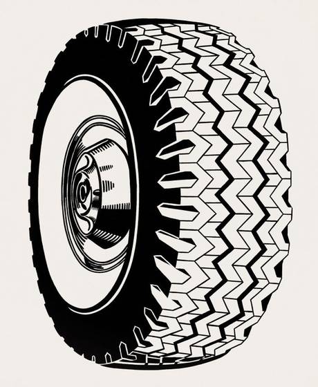
Around this time he was drawing stylised versions of adverts - such as Tyre - exploring symbols and representation, and how women were depicted in commercial imagery as extensions to household objects. Later, in his Mirrors series, he would return to themes of representation; whilst there are no reflections drawn, the shaped canvases and stylised lines inform us that we are looking at "mirrors."
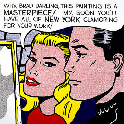
There's a strong sense of humour in much of Lichtenstein's work, with wry observations of the fickle nature of the art world; in Masterpiece (above), the young artist's rise is being predicted. Perhaps this was a tongue-in-cheek self-reference; the piece was displayed when Lichtenstein's own star was rising, at a solo exhibition at the Leo Castelli gallery in New York.
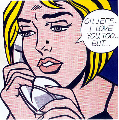
This is when he creates his classic Pop-Art works, based on war and romance comics, exposing clichés and stereotypes. The works are focused around the "Pregnant Moment" - the crux of a tale from which you can imagine the rest of a story, but at this exhibition we can see the original comics from which Lichtenstein drew his images. By knowing what he leaves out, as much as what he puts in, we understand what Lichtenstein wants us to focus on. I find the images surprisingly moving, evoking questions of loss, righteousness, anger, nobility and despair: Why were the soldiers fighting so long in the jungle? Who was the U Boat targeting? What did Brad do to upset her?
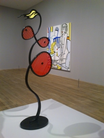
There was mixed success with his sculptures: I enjoyed his Explosion series, where he used steel mesh in place of Ben-Day dots, and Galatea, his take on the much-covered Greek myth of the statue that comes to life; but I found his exploration of Art-Deco's "domesticated Cubism" less engaging.
Throughout his career, Lichtenstein tried to engage with the Old Masters and explore theories of art. So it seems right that there is an entire section dedicated to his "Art On Art," such as Frolic; a surreal version of a Picasso piece, which references an illicit affair that Picasso was conducting with a young lover. Lichtenstein's series based on Monet's Rouen Cathedral were done because "no-one would expect it," but he was responding to the wide reproduction of Monet's work and raises surprising questions about form and delineation.
The Perfect/Imperfect series explores judgements of quality in art - Lichtenstein creates arbitrary rules about lines ending or beginning and, based on whether the work meets those criteria, the work is labelled either Perfect or Imperfect. I liked the cheeky triangles extending from edge of the Imperfect canvases, and the sculpture equivalent is appealing.
In later years, Lichtenstein returns to Pop-Art imagery with a series of enormous nudes. In these, much of the rawness of the work is lost, as the lines appear cleaner and more stylised - the colours brighter and more modern. But they evoked a strange sense of Dystopianism for me, different to the vulnerable emotional females of his earlier work. The women here seemed vacant and artificial - reduced to form and objectified.
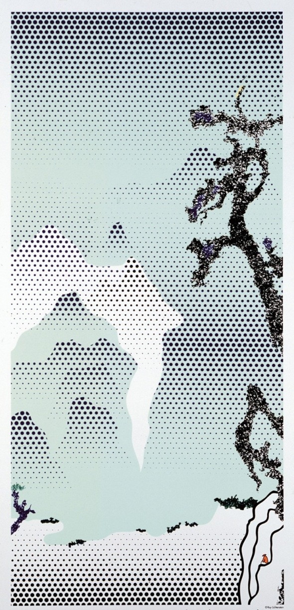
The final room is quite unexpected: Lichtenstein has re-interpreted classic Chinese landscape paintings with Ben-Day dots. Again, he is engaging with reproduction and Old Masters - this time the Chinese ones, whose work has been copied, non-industrially, by their protegés. The graduation and flow of the dots suggests cliffs, clouds, lakes and seas; the paintings only make sense the further you are from them, and in each is a lone figure picked out in a bright colour. I liked them. It made me reflect on where humans sit in existence. Maybe this was Lichtenstein's exploration of that topic as he neared the end of his own life.
This exhibition does what a Retrospective should: it covers the whole body and evolution of an artist and puts them in context artistically and historically. Not only did I learn that there is more to Lichtenstein than WHAAM! and Masterpiece but I enjoyed the exploration of the Philosophy Of Art. It's only on for another week so get there if you can.
Until May 27, sponsored by Bank of America Merrill Lynch. Tickets 020 7887 8888, www.tate.org.uk

